
The Ask:
Owner of the brand new small-batch ice cream shop, Kara, approached me with the sweet task of developing the brand identity for Little Spoon Creamery. Located on the central coast inside the SLO Public Market, the brand's mission is to make thoughtful, high-quality ice cream that brings people together. She wanted to create a timeless and clean brand identity that gives a "classic" creamery feel and appeal to all ages.
Deliverables:
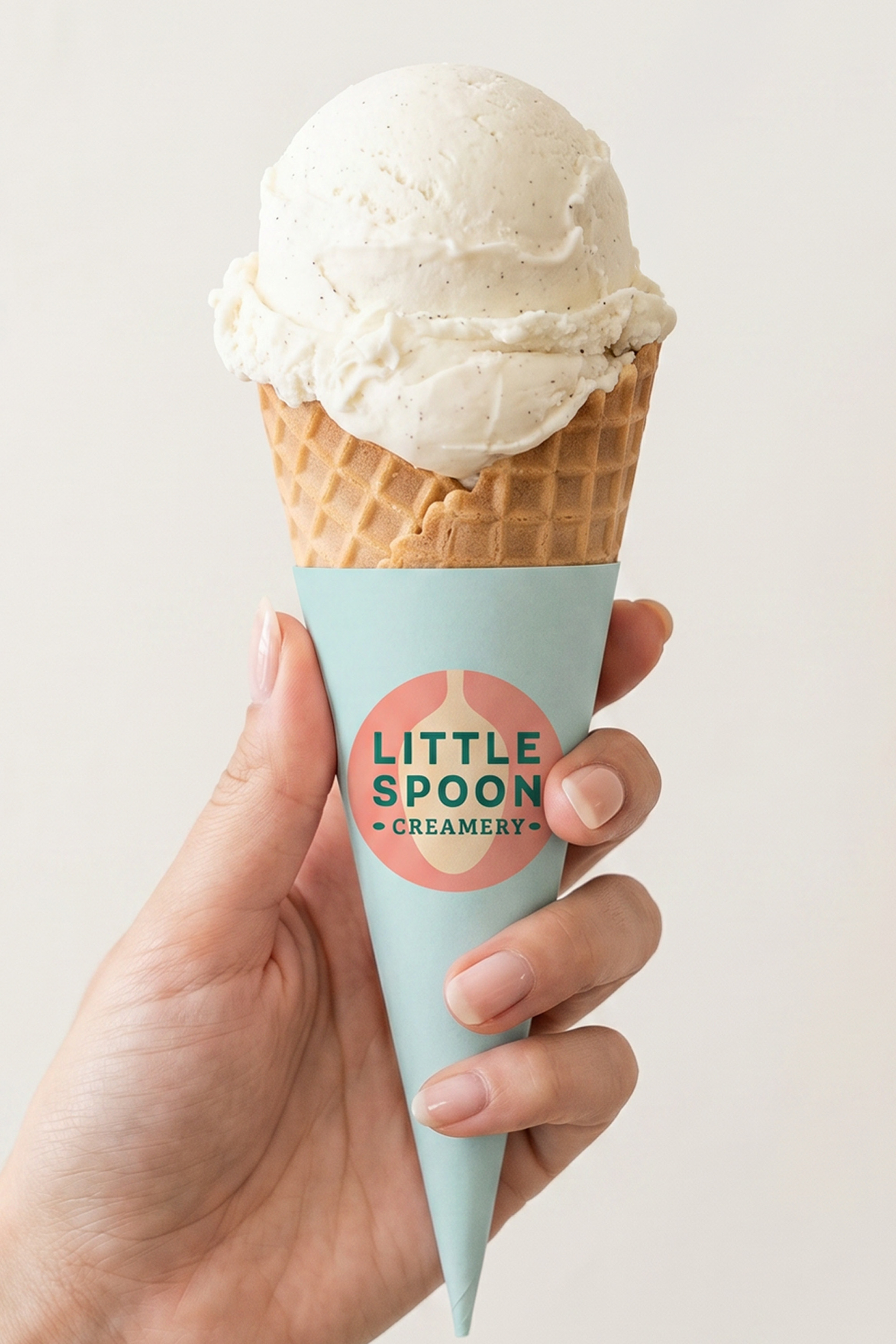
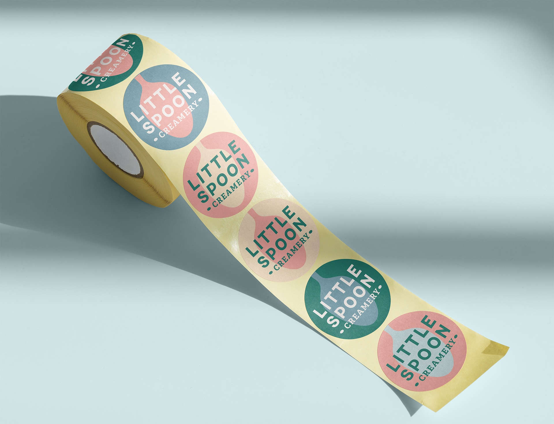
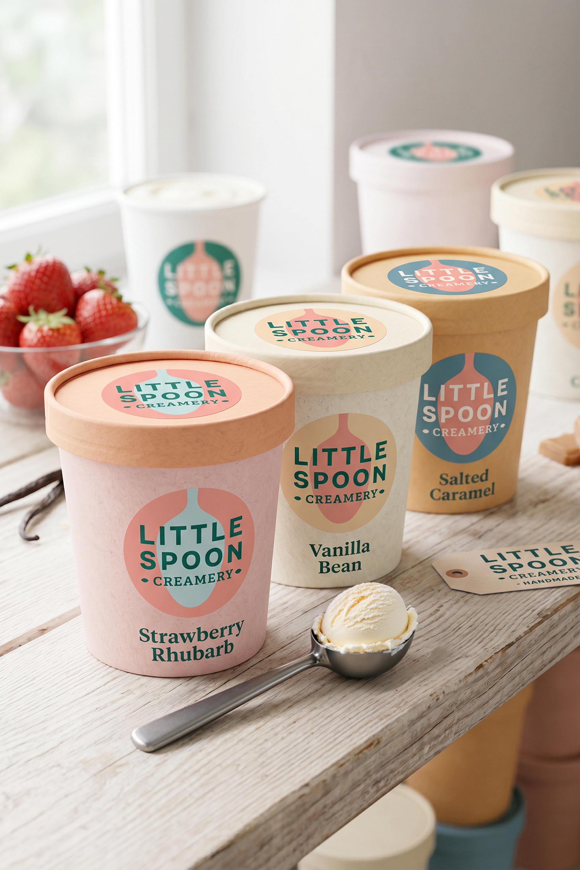
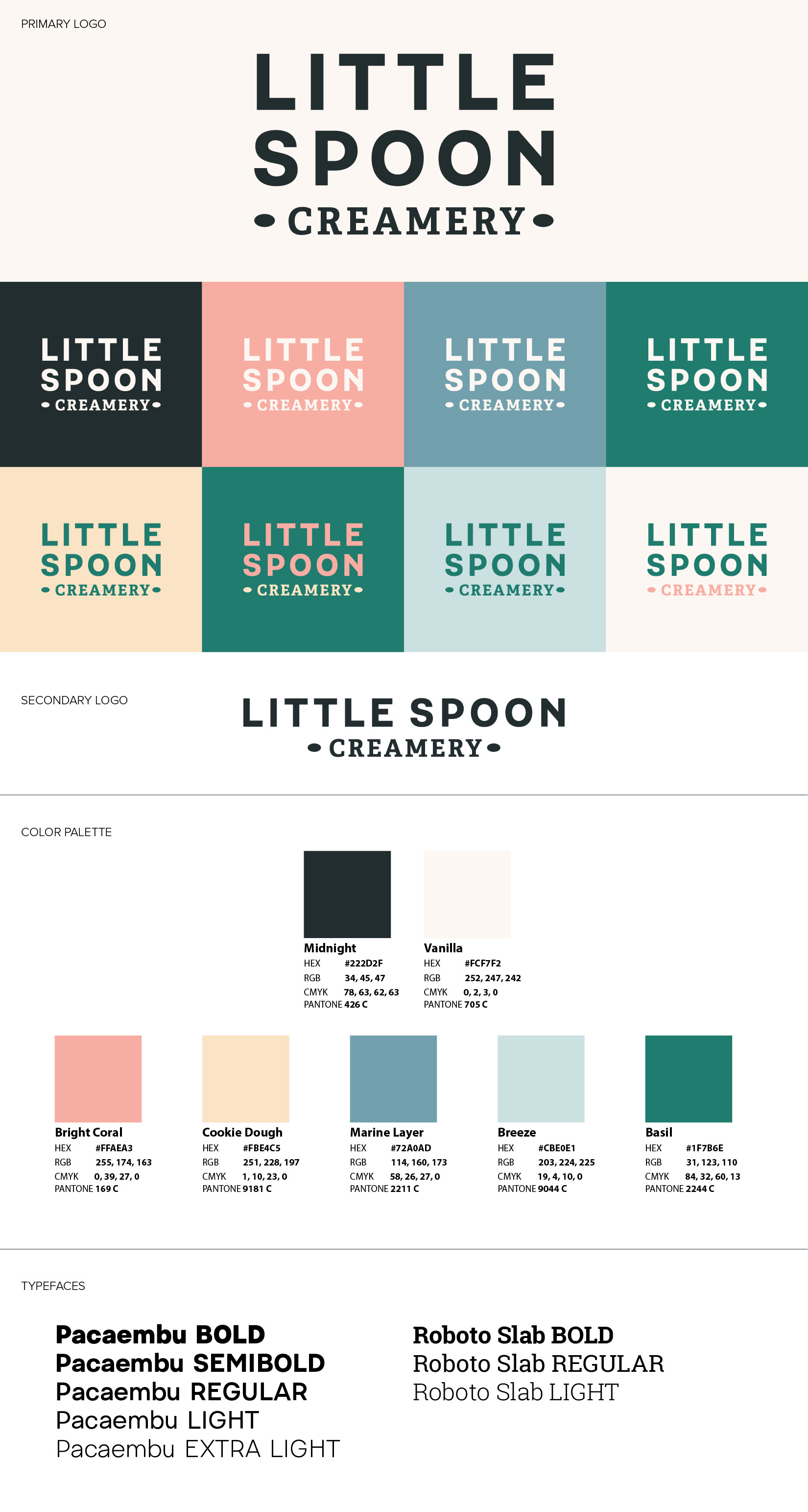
The final logo was developed in a flexible design system to allow for stacked and horizontal layouts, in many fun & different colorways. The typography is bold and clean, while the two ovals bookending "Creamery" give a nod to the shape of a spoon. The results are a no-frills, super clean, delicious brand identity!